That's a big deal here at the HappyGlyphs Studios, because being a stay at home Dad and a full time Cartoonist is not an easy task. At this point, finishing the back cover is worth raising a toast, and breathing a sigh of relief that at least that much is done.
Today's tip: give yourself time to cogitate. I started thinking about these covers several months ago, to give myself time to look them over, walk away, and look them over again, and I'm glad I did. I'll explain why.
 Here is a comp of my first concept for the back cover. I had originally wanted it to look like a handful of photos were tossed on a table, and that the text box was one of the photos.
Now this happened to match one of my original ideas, but I had other motivations. Not having found a publisher yet, I am investigating self-publishing. The reality of self-publishing is that color books are expensive, and that you can't add color pages to a black and white book, so... the covers are my place to shine, and show off my color work. In that vein, I wanted to place as many of my color pieces from 3 Knights in India that I could and still have it all look nice and balanced.
To be honest, I'm not sure this works for me. It's not a bad idea, per se, and maybe I could do more with this if I wanted, but another rule of thumb in design is this; simpler is usually better.

So onto another concept. In line with what I was thinking in my last blog, I wanted one image below the text box, and preferably one that would give a firm idea of the story to somebody picking up the book for the first time.
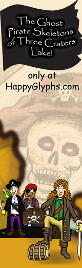
I came up with 3 images, but chose this one because it showed all 3 members of the Knight family enjoying a moment in Bangalore.
In comparison, it may not be as dynamic as the cascade of 'photos', but then again, it's not as busy. Both are good, but I have to now choose which one fits the story better.
Also, keep in mind that we must consider leaving space for a barcode, the nemesis of all cover designs! The second choice leaves space for the barcode without covering any of the artwork.
Hmm... so in a side by side comparison, I'm left with wondering which is the best concept for this particular book? Or am I missing a third alternative?
Any ideas? Suggestions? Comments?
I'd love to hear from you!
Cheers, JOHN :0)


No comments:
Post a Comment