First, Christmas cards, like any creative endeavor, begin with the idea. Without a good idea, there is no point to endeavoring further. Each year, John Steventon begins thinking up ideas for his annual Holiday card sometime around August. This is easy since here in America the stores begin setting up their Holiday displays at this time, and cheerful Christmas music reminds us that, although it's 95 degrees outside, Winter will be upon us in only a matter of months.
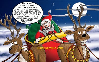
After a handful of ideas are weighed and measured, one lucky idea is chosen above others as being worthy. In this case, suppose Santa Claus, on his busiest night of the year, had a cell phone upon which he could be bothered. (see Figure 1) A silly idea, but funny when you put yourself in his shoes! The idea is then tweaked, the text written and rewritten for maximum humour, and then the kicker added... How does Santa feel about his cell phone? This gives us out punchline of "Why only bad kids get cell phones for Christmas".

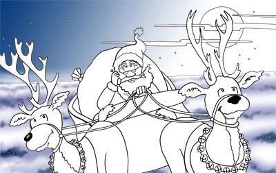
Next, the sketch is embellished, and made to fit the print area of the front of the card. The sketch is refined until it is nearly ready to be inked. Impoertant note: The final card is in color, so the sketch is created with color in mind, meaning little shading in the inking stage, and we can leave room for an elaborate background. In this case, I felt realistic clouds and sky would really make this card something to look at, and this could only be done in color. If this were to be in black and white, I would add a lot of shading and texture, such as shadows on the sleigh and fur on the reindeer. Since I do all of my coloring on the computer, I know I can add a lot of the details at the end.

Note the word snow at the top right of the image. I was originally planning on adding a light snowfall to the image until I realized that I was drawing Santa flying above the clouds! Also, note the tiny Big Ben in the lower right. I toyed with the idea of Santa flying low over the British landmark, but found it to be distracting. I opted later to add just a few houselights in the breqaks between clouds.
Now, since this was a tight sketch, there is no need to show the inked version, which is very similar. Instead, I will show in figure 3 the beginning of the coloring stage. I first put in the background sky and clouds because a) the colors are givens, b) they are large areas, and by filling in the large color areas first, I can begin to visualise better the entire color pallete of the piece, and c) these areas are not represented in the black and white sketch, so why not put them in now?
Finally, the rest of the colors are placed, choosing shades and hues that work well together, giving a pleasing overall balance to the piece. Usually I would have added the text balloon in the original inking, but in this case, I opted to add it later, so that the big white oval wouldn't distract me from the overall look of the color image. I needed, while coloring the piece, to keep in mind that the moon is the brightest object, and that all shadows reflect this. For this reason the words and balloon were added last. The web address is not on the final piece, but was added here to dissuade bad people from stealing our hard work.
So there. I hope we haven't spoiled the magic by revealing too much of the mechanics of this wonderful art that is Cartooning.


No comments:
Post a Comment