Sunday, February 26, 2006

Cartooning 101: How to Make a Christmas Card

Hello, and welcome to this, our first behind the scenes look at the goings on at HappyGlyphs Studios. In this blog, we will see an actual How-to approach to creating a cartoon Holiday card, with helpful hints and delightful insights into the mysterious world of Cartooning!

First, Christmas cards, like any creative endeavor, begin with the idea. Without a good idea, there is no point to endeavoring further. Each year, John Steventon begins thinking up ideas for his annual Holiday card sometime around August. This is easy since here in America the stores begin setting up their Holiday displays at this time, and cheerful Christmas music reminds us that, although it's 95 degrees outside, Winter will be upon us in only a matter of months.

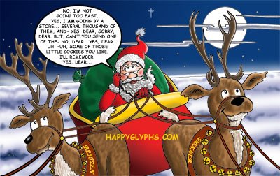
After a handful of ideas are weighed and measured, one lucky idea is chosen above others as being worthy. In this case, suppose Santa Claus, on his busiest night of the year, had a cell phone upon which he could be bothered. (see Figure 1) A silly idea, but funny when you put yourself in his shoes! The idea is then tweaked, the text written and rewritten for maximum humour, and then the kicker added... How does Santa feel about his cell phone? This gives us out punchline of "Why only bad kids get cell phones for Christmas".


Next, the sketch is embellished, and made to fit the print area of the front of the card. The sketch is refined until it is nearly ready to be inked. Impoertant note: The final card is in color, so the sketch is created with color in mind, meaning little shading in the inking stage, and we can leave room for an elaborate background. In this case, I felt realistic clouds and sky would really make this card something to look at, and this could only be done in color. If this were to be in black and white, I would add a lot of shading and texture, such as shadows on the sleigh and fur on the reindeer. Since I do all of my coloring on the computer, I know I can add a lot of the details at the end.


Note the word snow at the top right of the image. I was originally planning on adding a light snowfall to the image until I realized that I was drawing Santa flying above the clouds! Also, note the tiny Big Ben in the lower right. I toyed with the idea of Santa flying low over the British landmark, but found it to be distracting. I opted later to add just a few houselights in the breqaks between clouds.
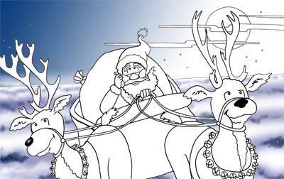


Now, since this was a tight sketch, there is no need to show the inked version, which is very similar. Instead, I will show in figure 3 the beginning of the coloring stage. I first put in the background sky and clouds because a) the colors are givens, b) they are large areas, and by filling in the large color areas first, I can begin to visualise better the entire color pallete of the piece, and c) these areas are not represented in the black and white sketch, so why not put them in now?

Finally, the rest of the colors are placed, choosing shades and hues that work well together, giving a pleasing overall balance to the piece. Usually I would have added the text balloon in the original inking, but in this case, I opted to add it later, so that the big white oval wouldn't distract me from the overall look of the color image. I needed, while coloring the piece, to keep in mind that the moon is the brightest object, and that all shadows reflect this. For this reason the words and balloon were added last. The web address is not on the final piece, but was added here to dissuade bad people from stealing our hard work.

So there. I hope we haven't spoiled the magic by revealing too much of the mechanics of this wonderful art that is Cartooning.

Wednesday, February 22, 2006

Cartooning 201: 3 Knights in India, the Back Cover Story

I still haven't come up with a design or image for the front cover of my soon to be finished graphic novel, 3 Knights in India. The good news? I think I've settled on a design for the back cover!

That's a big deal here at the HappyGlyphs Studios, because being a stay at home Dad and a full time Cartoonist is not an easy task. At this point, finishing the back cover is worth raising a toast, and breathing a sigh of relief that at least that much is done.

Today's tip: give yourself time to cogitate. I started thinking about these covers several months ago, to give myself time to look them over, walk away, and look them over again, and I'm glad I did. I'll explain why.

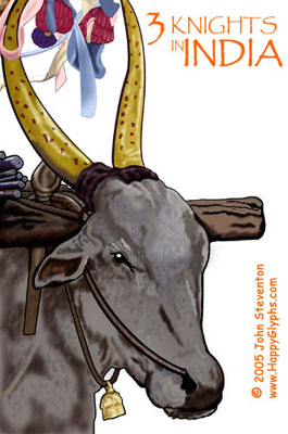
Here is a comp of my first concept for the back cover. I had originally wanted it to look like a handful of photos were tossed on a table, and that the text box was one of the photos.

Now this happened to match one of my original ideas, but I had other motivations. Not having found a publisher yet, I am investigating self-publishing. The reality of self-publishing is that color books are expensive, and that you can't add color pages to a black and white book, so... the covers are my place to shine, and show off my color work. In that vein, I wanted to place as many of my color pieces from 3 Knights in India that I could and still have it all look nice and balanced.

To be honest, I'm not sure this works for me. It's not a bad idea, per se, and maybe I could do more with this if I wanted, but another rule of thumb in design is this; simpler is usually better.


So onto another concept. In line with what I was thinking in my last blog, I wanted one image below the text box, and preferably one that would give a firm idea of the story to somebody picking up the book for the first time.

I came up with 3 images, but chose this one because it showed all 3 members of the Knight family enjoying a moment in Bangalore.

In comparison, it may not be as dynamic as the cascade of 'photos', but then again, it's not as busy. Both are good, but I have to now choose which one fits the story better.

Also, keep in mind that we must consider leaving space for a barcode, the nemesis of all cover designs! The second choice leaves space for the barcode without covering any of the artwork.

Hmm... so in a side by side comparison, I'm left with wondering which is the best concept for this particular book? Or am I missing a third alternative?

Any ideas? Suggestions? Comments?
I'd love to hear from you!

Cheers, JOHN :0)


Thursday, February 16, 2006

Cartooning 201: 3 Knights in India, the Cover Story Part I


So I'm trying to finish my graphic novel, 3 Knights in India, right? I'm drawing a new strip every week for the India Post, while at the same time putting the entire book together in Pagemaker, and creating extra illustrations and writings to flesh it out.

Of course, the most important part of a book, the part that grabs the reader and invites them in, is the cover. It's good to have the cover done ahead of time, so you can start creating promotional materials, and show everybody what a great artisty you are, and stuff like that. And the good news? I finished the cover... in fact, it was one of the first things I did.

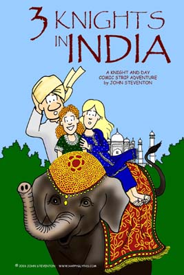
And it's not bad as far as covers go; it's dynamic, eye-catching, and most importantly, actually shows the 3 Knights... in India.

The problem? I did this two and a half years ago. It's been all over my website, and seen in several newspapers, and my family have all sorts of outerwear with this image emblazoned upon it. I even used it for the cover of my first comic book. The prognosis? It's old.

Besides, I've grown as an artist. I should be able to outdo this, right? Rule #2 in this business is this: Don't keep recycling your stuff. Sure, show off your good stuff, but eventually you have to move on. If you're any good at all, you're going to keep on working, and keep on getting better.

So now I have a new problem... something I really haven't faced before, and it's starting to really, really bug me, like a mosquito in the ear.

I'm out of ideas.

Seriously, I'm not used to this. But let me clarify... I have about 6 ideas that I have sketched out, and I'm not 100% happy with any of them. Usually, when I need an idea, I let it cogitate in the old grey matter for a while, and then sudenly 'boom', it hits me in the shower, just in time to save the day!

So maybe I need to finish this book already, and get to that 'needing' part. Maybe some part of my brain realizes we have time yet, so it's slacking off. It's unfortunate that the conscious brain has very little influence on the unconscious, allowing the unconscious to get all cocky and all "I'll get to it when I'm ready".

Damn. So onto rule #3. Don't go with your first idea, or even the first 6 ideas, if you're not happy with them, 'cause if you ain't happy with it, who will be?

So back to the drawing board. Hmm... I need to show the 3 Knights, in India. Something colorful, preferably involving a cow...

Well, if I come up with anything, maybe I'll do a How-To page, showing the creation of a comic cover? Meanwhile, here are the covers to the second and third 3 Knights in India comic book covers ( available at my website ), just to show that I do get ideas once in a while. Cheers!