Showing posts with label vector illustrations. Show all posts

Thursday, May 22, 2008

New Magazine Cover


I just received my comp copies of CURRENTS magazine, which not only includes a slew of new artwork of mine, but this is also my third magazine cover, and I'm very pleased with it.

The cover was created in Adobe Illustrator CS3, with some touch up in Adobe Photoshop CS3. I'm becoming much more familiar with Adobe Illustrator, and this new version has some nice features in it that make me rely less on Photoshop to complete a cover like this. Once upon a time I'd need to do a lot more finishing and color adjustment in Photoshop, but I've found transparency adjusting in Illustrator, and other helpful items which have enabled me to create much better work, in less time.

The Statue of Liberty was created first, and in much detail, so that the image could be taken apart and enlarged to create sub images for inside the magazine. This wasn't done, but I am planning on using Liberty herself to make a fine poster.

Something I shouldn't admit here, but since I try to use photo reference for those little details that create realism, I found myself having to pose for the guy on the right waving his cap. I just couldn't get my models to do it right (4 year olds are really hard to work with), so I did it myself, and so there, that's me on the cover of CURRENTS. :0)

After CURRENTS magazine, I created illustrations for my first Annual Report. Yes, the freelance career has really taken off, and I'm hoping to be able to do more high end work like this. For the Annual I created 10 fine art type pieces based on ports of the world, which was really fun considering my interest in travel. I'll definitely show off that artwork after the Annual has gone to print either here or at my travel blog, or both.

And speaking of blogs, I'm thinking of starting a third blog to feature The Inquiring Minds. I'm still looking for a big venue for the strip, so maybe a blog is in order to focus on the strips and build more of an audience.

Magazine Art Directors are welcome to contact me for copies of my work or hiring info. You may also check out my online portfolio , which is currently being updated. And please look at my previous post for a Vector Illustration comic book cover.

Cheers, JOHN :0)


UPDATE: Inspired by posting, I went and finally finished the Statue of Liberty print I mentioned in this post. I also used a 'stained glass' technique that I have been experimenting with, which gives it a unique and beautiful appearance. See the art below, or you can preview and buy the print at my Lulu.com shop.

Monday, April 21, 2008

A Funny Thing Happened...

Somehow or another, I started calling myself an Illustrator, instead of Cartoonist. I've been a Cartoonist for a long time now, but suddenly, my Freelance work has pulled me into new directions, somewhere between illustration and fine art. As much as I hate to admit it, but Freelancing pays more than my cartoon and cartoon book publishing does, at the moment, so most of my time goes in that direction.

The funny thing is, though, that I saw Freelancing as a way to expand myself as an Artist, and especially as a Cartoonist. My cartooning actually improved, for awhile, but now it's so hard to tell because very little of what I am currently doing is cartooning.

Am I complaining? No... I like creating, and mentally, art is art. Creating something that is nice to look at, or has something to say, or both, is very rewarding. And trying someting new and actually succeeding at it? Good stuff. And getting respect for your work, which Cartoonists very rarely get? Nice.


Then again, creating an entire world where your own characters interact within their own continuity, and events that you initiated start running off on their own, well... that's great too. Really great.

And then there's the smell of ink, and the feeling you get when you ink in panel borders and realize that you've just opened a window into that other world, and any minute now your characters will be there to share a laugh.

Yeah, that's great, too. :0)


Cheers, JOHN :0)

On my iPod right now? Echobelly - People Are Expensive

Thursday, November 08, 2007

Baby Steps


When my client called me one night, asking for a magazine cover that showed "the entire city of Shanghai, with the river in front of it, and a bunch of ships going by", well, I didn't know what to say. At first I thought the guy was crazy, and then I thought that I was crazy for considering it.


How the heck was I going to do this, using the technique of vector illustrations, to which I was still relatively new?


The answer, of course, is one step at a time. As the old saying goes, a journey of a thousand miles begins with a single step.... a baby step, even.


There have been a few times in my career when I've seen some great art, and said, "Wow! How the heck could anyone do that? Are they even human?" THe answer is, yes, they're human. They just have a lot of skill, and probably put a lot of time into developing that skill. And, just as important, they had the confidence to start, and complete, something great.


Trust me on this: if you want to survive in this, or any other artistic endeavor, you need some good portfolio pieces. Not something you did in school, unless you graduated in the last six months, and not something you did while watching TV one night.


Thanks to this same client, I've had a few assignments which have taken me nearly a month to complete from start to finish. Not an easy task, especially in this day and age where we want everything right away. Still, you take a deep breathe, and begin.


The above illustration, actually a photograph of the magazine itself, shows the completed work. It took me between 3 and 4 weeks to do, working hours at a time, and using about 40 different photographs for reference. This reminds me, step two, after taking a deep breathe, is to do some research. Today it's easy to run to the internet, but for something like this, 72 dpi just doesn't cut it. Googled images just don't compare to books, magazines, and a good photo morgue.


So, you do some research, and then what? Sketch, sketch, sketch. That's right... get a real pencil and paper if you can find them, and sketch. Sketching on the computer just isn't the same, at least for me.


Once you have a good sketch, you scan it into Adobe Illustrator, and work it up in steps. Block out huge areas of color, determine your light source, place in large structures... just like you learned in art class as a kid. Use basic shapes and colors until you have a well balanced piece.


From there you add enough detail to suit the piece. For this piece I wanted plenty of detail, and at one point I had about 11 layers of details for the city alone. I worked back and forth until an overall balance was achieved, checked my light and shadows, and tweaked the colors for harmony. I didn't stop until I was happy with the work, and trust me, I'm happy.


Fortunately in this case I had plenty of time to work before the deadline, and had no need to rush. For me, this is one of my finest pieces of work, and I would put it against any other magazine cover of its type. I'm very proud, after the fact, and have a terrific portfolio piece to show for all that hard work.


Cover detail from the November Issue of CURRENTS magazine.


To be honest, though, there were a few days at the beginning when I was pulling my hair out, sweating a bid, and thinking impure thoughts. But that's where the confidence comes in.


Youhave to believe in yourself, take that first baby step, and say to yourself, "I know I can, I know I can..."


Cheers, and let me know what you think, JOHN :0)


PS The original art is even better to see, but I've had too many problems with theft to show any high res stuff on the internet anymore. It's a shame that some people out there have to live their life by feeding off of others, but it is a sorry fact of life.


PSS What's on my iPod today? Bob Dylan, Tangled Up in Blue. The lyrics just slay me.


Monday, May 07, 2007

Vector Illustrations: a Reinvention

Sometimes you have to reinvent yourself, whether for personal growth, or just to get out of a rut, or whatever the reason. It's healthy, and for an artist, sometimes essential. If you do the same thing every day, you will eventually get into a rut. However, if you try something new once in a while, you might just learn something, and grow in the process.

I like Cartooning. I love it, in fact, and plan to continue being a Cartoonist. However, when a client asked me to create a cover and interior illustrations for their glossy magazine, I knew that I had to come up with something different.

Way back when I took some art and design classes, I got a decent background on creating vector illustrations. I like (good) vector illustrations, and have always wanted to create some. Of course, with near constant deadlines, there is very little time to stretch creatively. I knew this was my big chance to try something new. In the process, I hoped to learn something that I could bring back to my Cartooning, as well.


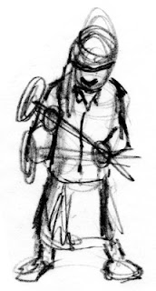
Vector Illustrations are entirely created on the computer, but as with any good art project, I began with some sketches. Sketches, as in plural: That's important. I really should show you all of my sketches, but trust me, they were bad. In fact, I started this project with an earlier sketch, and had to toss it all away, and begin again.

Lesson 1: the biggest mistake that beginners of computer illustration make is that they sit down at the computer and start working without any direction. An experienced artist could possibly sketch at the computer, but I still prefer paper and pencil. Always make several sketches, if not for yourself,then for your clients. Your initial sketch is usually not as good as your 4th or 5th, so do at least four sketches. I like this sketch because it has weight: you can feel how heavy the hammer is.


Now, I use Adobe Illustrator to create my vector illustrations. I am not going to teach you how to use that program here, but I will recommend taking a class as opposed to reading books on the subject. A good teacher can arm you with a variety of time savers and shortcuts that you may otherwise not pick up on your own.

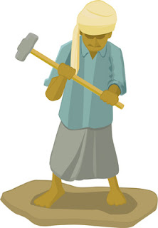
So, to begin. First thing I do is scan in my sketch, and create a second layer to work on above it. I then choose my color pallete, and lay out flat colors in the basic shapes of the sketch. Working in layers is important, and can save you a lot of aggravation later! I am not a pro yet at vector illos, but I quickly learned that you can have thousands of shapes in one illustration, and keeping each unit of your drawing on a different layer will save you a lot of time.

After I am happy with the colors, and layout of the drawing, I then do the next important thing: I choose a light source. I cannot stress how important light is in almost any illustration. I mark this in some fashion, and then start laying in shadows to indicate to the viewer the light source.


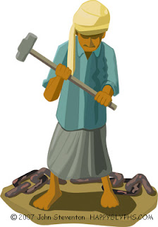
Much later, you can see my progress in the image above. I continued adding shapes to create more detail in the image, to indicate the folds and hang of cloth, to emphasize the weight, etc. I deepened the shadows, added secondary shadows, and played with the color pallete a bit to indicate the bright sun of an Indian beach. I also added the chain to create more interest, and to tell the viewer more about this scene: as a stand alone image, you need to add props to indicate 'place'.


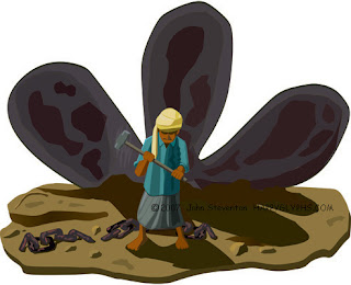
Finally, I decided to extend the background. I was happy with the look of the character: He looks tired, the hammer looks heavy, and you can see that he's been working hard. Still, I wanted to further isolate him... make him look smaller, and create more sympathy for him in the viewer's mind.

This illustration is for an article on ship breaking on the coast of India, which is a tough job. I wanted to give the viewer more of a feeling for this work, and more background in this illustration. I created the rusting propeller separately, and then moved it into this illustration. The nice thing about Vector Illustrations is that you can scale objects without losing resolution. I played with the illustration until I was perfectly happy with it, and then added more of the beach, and chain, and some rocks and other stuff, to finish the illustration.

I then went over the entire thing, looking for mistakes, and making sure that all the shadows indicated the same lightsource. That's something you have to look for if you bring two images together like this.

So there. Not bad for a first attempt, eh?

You'll be able to see more of this type of work at my homepage, and at my Freelance Portfolio page.

Cheers, JOHN :0)

What's on my iPod today? Kansas, Dust in the Wind.