I like Cartooning. I love it, in fact, and plan to continue being a Cartoonist. However, when a client asked me to create a cover and interior illustrations for their glossy magazine, I knew that I had to come up with something different.
Way back when I took some art and design classes, I got a decent background on creating vector illustrations. I like (good) vector illustrations, and have always wanted to create some. Of course, with near constant deadlines, there is very little time to stretch creatively. I knew this was my big chance to try something new. In the process, I hoped to learn something that I could bring back to my Cartooning, as well.

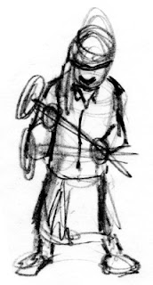
Vector Illustrations are entirely created on the computer, but as with any good art project, I began with some sketches. Sketches, as in plural: That's important. I really should show you all of my sketches, but trust me, they were bad. In fact, I started this project with an earlier sketch, and had to toss it all away, and begin again.
Lesson 1: the biggest mistake that beginners of computer illustration make is that they sit down at the computer and start working without any direction. An experienced artist could possibly sketch at the computer, but I still prefer paper and pencil. Always make several sketches, if not for yourself,then for your clients. Your initial sketch is usually not as good as your 4th or 5th, so do at least four sketches. I like this sketch because it has weight: you can feel how heavy the hammer is.

Now, I use Adobe Illustrator to create my vector illustrations. I am not going to teach you how to use that program here, but I will recommend taking a class as opposed to reading books on the subject. A good teacher can arm you with a variety of time savers and shortcuts that you may otherwise not pick up on your own.
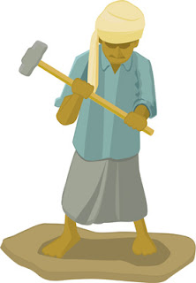
So, to begin. First thing I do is scan in my sketch, and create a second layer to work on above it. I then choose my color pallete, and lay out flat colors in the basic shapes of the sketch. Working in layers is important, and can save you a lot of aggravation later! I am not a pro yet at vector illos, but I quickly learned that you can have thousands of shapes in one illustration, and keeping each unit of your drawing on a different layer will save you a lot of time.
After I am happy with the colors, and layout of the drawing, I then do the next important thing: I choose a light source. I cannot stress how important light is in almost any illustration. I mark this in some fashion, and then start laying in shadows to indicate to the viewer the light source.

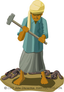
Much later, you can see my progress in the image above. I continued adding shapes to create more detail in the image, to indicate the folds and hang of cloth, to emphasize the weight, etc. I deepened the shadows, added secondary shadows, and played with the color pallete a bit to indicate the bright sun of an Indian beach. I also added the chain to create more interest, and to tell the viewer more about this scene: as a stand alone image, you need to add props to indicate 'place'.

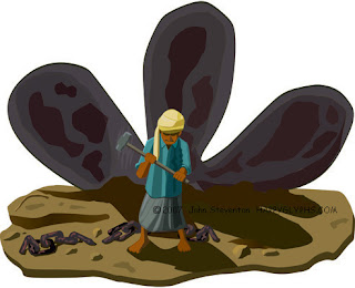
Finally, I decided to extend the background. I was happy with the look of the character: He looks tired, the hammer looks heavy, and you can see that he's been working hard. Still, I wanted to further isolate him... make him look smaller, and create more sympathy for him in the viewer's mind.
This illustration is for an article on ship breaking on the coast of India, which is a tough job. I wanted to give the viewer more of a feeling for this work, and more background in this illustration. I created the rusting propeller separately, and then moved it into this illustration. The nice thing about Vector Illustrations is that you can scale objects without losing resolution. I played with the illustration until I was perfectly happy with it, and then added more of the beach, and chain, and some rocks and other stuff, to finish the illustration.
I then went over the entire thing, looking for mistakes, and making sure that all the shadows indicated the same lightsource. That's something you have to look for if you bring two images together like this.
So there. Not bad for a first attempt, eh?
You'll be able to see more of this type of work at my homepage, and at my Freelance Portfolio page.
Cheers, JOHN :0)
What's on my iPod today? Kansas, Dust in the Wind.


3 comments:
I cannot agree with you more on 'Lesson 1'.
I have been doing CG for quite some time, and always, I feel confident only after a couple of doodles on real paper with pencil or pen.
Thanks for writing, Vyoma.
I find that I can get a lot more 'spontaneity' in sketches done on paper, and as I mentioned, a good initial sketch is vital to a good finished piece.
Even with a tablet, I still feel more comfortable with the old pen and paper.
Cheers, JOHN :0)
John.....
That is awesome for a first attempt! Really cool.
BTW, the article you mentioned about ship breaking, that wasn't the one in the NY Times, was it? There was a really long article about it in the NYT a couple of months ago, but I don't remember seeing any cartoons with the article. :-)
Scanning in your sketch into Illustrator, that is not the 'normal' way of creating vectors is it? :-) I thought most CG artists used Illustrator to directly sketch onto the computer (with or without their paper sketches as references). I guess scanning in your already sketched image *is* faster.
ciao,
Post a Comment