Friday, March 10, 2006

The Back Cover, Part II

A bittersweet moment is upon me! I'm drawing the final strips of 3 Knights in India right now, and finishing off the covers, and some extra interior illustrations. After nearly 3 years, it's hard to believe that I won't be working on this graphic novel anymore!

Oh, I'll be promoting it, of course, which is a full time job in itself, but it just won't be the same as writing and sketching on a daily basis for so long. Still, you have to let go of the apron strings eventually, so that each little book can go off on its own to make its mark on the world.

And I do have a list of other projects to work on, besides the Freelance gigs, so it will be exciting to start something new. More word on those as the time comes.

For now, I've got to finish this book quick; the story will complete itself in the newspapers in just a couple of weeks, and I want the book to be available soon after.

So here's the back cover, for those of you following its evolution here at the blog. I knew I needed a fancy border for the back cover, since nothing says 'India' like a fancy colorful border. I drew up a cool looking Ganesha, as well, but I won't post that here. I'm saving that for the t-shirts :0)


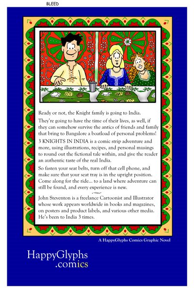
I added the new illustration to the back. Actually, this came from the back of the second comic book, so it's not exactly new, but I wasn't planning on adding it to the graphic novel, so I'm happy to find a place for it. I had something else in mind, but this illustration suits the back cover needs really well. First of all, it's small, so I still have room for a barcode, and second, it does show all 3 Knights again, this time in a more traditional setting than on the front cover. I like the modern India versus traditional India in the illustrations, plus the looks on Steve and Amy's faces goes very well with the starting text, "Ready or not, the Knight family is going to India".

All Most Comments welcome! Just click on the word comments at the end of any blog :0)

Cheers, JOHN :0)

Monday, March 06, 2006

Censorship and Sensibilities

As if I don't have enough to do in getting my graphic novel completed on time, but of course, up crops an 'issue'. Okay, this issue had actually cropped up a long while back, but enough people have now brought it to my attention that it merits another look-see... especially since 3 Knights in India is going to print soon.

Okay, take a look at the comic ahead, and prepare to gasp in shock and horror!


All right, personally I don't see anything wrong with the image, but who am I to argue when my wife my audience demands asks that I perhaps change something in my work. Okay, personally I don't like being told what I can and cannot do within my own work, but on the other hand, I do ask for opinions, and appreciate them when I get them. So I listen, and weigh, and decide.

By the way, the point in discussion here is Rekha's t-shirt emblazoned with the words FCUK on it. All young upscale shoppers know that stands for French Connection U.K., and I've seen their ads in public places, and their stores in upscale malls. For me, I wanted my audience to look at Rekha and know that right away we're dealing with a firecracker here... someone looking for trouble.

So what to do? Do I stand by my guns, and risk offending, and even losing, members of my audience? Or do I see things from their point of view, and look for a compromise?

I could see Rekha wearing a shirt that says "All This and Brains as Well", but that's a little too long and distracting... and not nearly biting enough. And I suppose the words 'Bite Me' on the shirt doesn't really address the issue.

So again, what to do? I have a week or so to decide, so let me think about it. Meanwhile, your opinions are welcome, of course.

What will I end up doing? You'll just have to buy the book to find out :0)

Toodles, JOHN :0)

Thursday, March 02, 2006

Cover Story: Part III

So here it is, the cover to my forthcoming graphic novel 3 Knights in India. Compare this with the sketch in the last post, and the image for the back cover posted earlier. You can see that I stayed true to the rough sketch, but redrew the image to fit the book cover layout better. I made some small changes here and there, and changed some colors to create a more balanced and dynamic layout.

It's amazing to me that just a few days ago I had no idea where I was going to go with this cover, and now it's done and I can actually picture what the book will look like when finished. It's a great feeling when a book starts to fall into place.

And now that the cover is done, and the back cover in progress, I can begin creating ads and working on marketing. I already have an interview lined up, and will talk about that later when it happens.

Cheers, JOHN :0)