There are many ways of creating an illustration, and many tools to use. We can certainly argue that using a brush creates a varied line, which reproduces well, and looks great, but many Cartoonists are doing fine right now with the steady line of Art Pens. Some Cartoonists are skipping the inking process altogether, which sometimes looks great if you can reproduce their pencil linework, and other times just looks like they were late for a deadline.
Heck, some Cartoonsits could use crayon on old paper bags, and still look great, so let's agree that much of Cartooning can, and SHOULD, be left to interpretation. However, and I have to emphasize this, HOWEVER, there are some things that you should never do, and I feel the need right now to discuss this before the top of my head blows off.
Today, the use of Adobe Photoshop has changed the landscape of modern comics, and the use of filters and special effects have given comic books some strange looks in the last couple of years. Experimentation is fine, but one thing I see too much of today is cutting and pasting of a single drawing, and using it over and over. Here's an example:
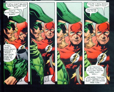
Now please understand that I don't mean to pick on this artist. I see this happening in a lot of comics today, but these examples are in a best selling book, and frankly are unforgivable for reasons that I will go into.
Please note that the same exact drawing of Green Arrow was used four times in four concurrent panels, and that one drawing of the Flash was used 3 times here. Why is this so awful? First of all, the image of the Flash is a bad expression to begin with... I can't tell if he's constipated, or if he died and was stuffed. The latter seems more likely since words are coming from his mouth, which is NOT open. Damn, I just want to scream looking at this. I understand that Artists have deadlines, and I might have looked the other way except that this is sheer, pure laziness. At the every least, use the same image, but modify it slightly. Zooming doesn't count. Change the mouth, or have the eyes blink or look around. Something! Anything!
Now this isn't new. People have been doing this for decades, except in the old days we used photocopiers or lightboxes to reproduce drawings, in an effort to either save time, or capture a particularly fine drawing that we were afraid we might not be able to reproduce. Gary Trudeau of Doonesbury was famous for this, and I remember reading that a Critic praised him for this innovation. At the time, I thought, "oh wow, that's so clever!" but now that I'm a Cartoonist myself, I know what's going on here.
Why am I so bothered by this? Because there are certain laws of storytelling that you never, ever break, and the most important is NEVER kick the reader out of the story, because he or she may not come back. When a reader is immersed in your world, you have achieved something special. Do anything to interrupt that special bond, such as a bad typo, or a character acting out of character, or some bad artwork, then you have failed.
I do not want to pick on this particular artist, but if I was the writer of this story, and the artist did this to my work, I think I would flip out. I would lose it completely and go postal and probably never forgive them. Here is another example from the same story.
Again, this angers me because the Artist first of all took a particularly bad facial expression, and multiplied it. I don't want to see this face the first time! And then to have words come out of the characters closed mouth? Once might be an oversight, but here I've posted 2 examples.
As I've mentioned, we have all done this. We've taken images and traced over them, but a decent artist modifies it so that the reader doesn't see that it's the same image. Repetition is a key factor in fine art and even good Cartooning, but placing the exact same image on a page in a comic narrative distracts the reader.
This is something that we just shouldn't do.
Now, having said this, let me now show an example of where I myself have done this. Maybe placing the same image can work, if used correctly? In The Wolfman of Beckenham, Kent, the story is told in narration, while we the reader are seeing through the eyes of somebody nosing around the Wolfman's apartment. In the image below, I want to emphasize the 'hairy feet' by having the viewer zoom in on them. I tried this with the feet in the second panel being in a different position, but found that distracting. I suppose I could add a third panel, crowding things a bit, but go for a 'double-take' effect. Perhaps I will try this later, and post the results.

Anyways, I've broken my own rule, and am leaving it up to you to let me know what you think. Does this distract you, the reader, or does the 'zooming in' serve to emphasize the funny feet? In other words, does this work?
I look forward to your thoughts on the matter.
Cheers, JOHN :0)