Showing posts with label Adobe Illustrator. Show all posts

Saturday, August 08, 2009

Leggo my LEGOS!


What's better than The Inquiring Minds? Could be LEGO Inquiring Minds!

This illustration was a lot of fun at first, but became a major endeavor. That's fine, because I wanted a nice portfolio piece to show off my Adobe Illustrator skills, but man! What a lot of work. OF course, I was in the process of moving at the time, so it might not have been so tough if I just sat down and worked on it, instead of working while packing my studio up. :0)

Anyways, this is yet another reason for the delay on The Ghost Pirate Skeletons of Three Craters Lake, which shall return this week! Huzzah! This and another LEGO piece are featured in the next cartoon, as you'll see soon.

Meanwhile, please enjoy the illustration and feel free to comment on it, unlike my freinds at FaceBook who only seem to comment when someone posts a baby picture. I mean, c'mon, people! I worked hard on this! :0)

Meanwhile, I'm working on yet another book, and you can find snippets of that at my travel blog, The Travelling 'Toonist.

And oh yeah, the new HappyGlyphs Comics Website is just about ready, so check it out!

Cheers, JOHN :0)

Thursday, August 14, 2008

Math: The Necessary Evil

All right, I actually like math, but sometimes the details can bog you down when you'd rather be drawing or something else a bit more fun than calculations. However, as we've all been told, math really is a big part of life. Can you live without it? Maybe. You'll have a lot of problems, though. :0)

Now, I've gone on and on about the importance of learning to do things right, or do things the 'old fashioned way', or by hand. The reason is this: you learn why you are doing things, and in so doing, understand better how to do them. Okay, I'll admit that Paste Up and Mechanicals are a heck of a lot easier to do on the computer than by hand. Any of you taking Graphic Design can attest to that. All of that drawing fine lines in exacting places, and pasting your little registration marks, and all that stuff can be a real headache. In Pagemaker, Quark, or InDesign, you just type in a bunch of numbers, and voila... right?

Wrong. These programs are easy to use, but not totally intuitive. I've laid out several books by now, and of course each of them have to be different... different sizes, different margins, this one bleeds, that one doesn't. My problem is, at least with the current InDesign, I don't seem to have all the options I would like. The printer's specs have changed, and now I'm finding myself trying to change a full sized document midstream! Retroactively, it doesn't seem to be working. The program handles bleeds differently than the printer asks, so I'm finding myself working out the numbers myself, carefully checking that math, and now basically laying out the book on paper, the old fashioned way, and saying bugger all to the program.

So where are you when all you know is the computer and the program? Up a certain creek without a paddle, especialy if you have a deadline, and do not work well under pressure! :0) (I work well under pressure, but my math skills jump ship)

So here I am with my little calculator, my ruler and pencils, and heck, I may as well go get some graph paper, if they even make that anymore. Yep, the same tools that Cartoonists and Designers have used for the last century still do the job just right.

And best of all, these tools work when the power is out. :0)

Beat that, Bill Gates, Adobe, and the lot!

Cheers, JOHN :0)

PS I love my Adobe programs... mostly. I do.

What's on my iPod today? Crash Test Dummies, A Worm's Life and Genesis, Abacab

Thursday, May 22, 2008

New Magazine Cover


I just received my comp copies of CURRENTS magazine, which not only includes a slew of new artwork of mine, but this is also my third magazine cover, and I'm very pleased with it.

The cover was created in Adobe Illustrator CS3, with some touch up in Adobe Photoshop CS3. I'm becoming much more familiar with Adobe Illustrator, and this new version has some nice features in it that make me rely less on Photoshop to complete a cover like this. Once upon a time I'd need to do a lot more finishing and color adjustment in Photoshop, but I've found transparency adjusting in Illustrator, and other helpful items which have enabled me to create much better work, in less time.

The Statue of Liberty was created first, and in much detail, so that the image could be taken apart and enlarged to create sub images for inside the magazine. This wasn't done, but I am planning on using Liberty herself to make a fine poster.

Something I shouldn't admit here, but since I try to use photo reference for those little details that create realism, I found myself having to pose for the guy on the right waving his cap. I just couldn't get my models to do it right (4 year olds are really hard to work with), so I did it myself, and so there, that's me on the cover of CURRENTS. :0)

After CURRENTS magazine, I created illustrations for my first Annual Report. Yes, the freelance career has really taken off, and I'm hoping to be able to do more high end work like this. For the Annual I created 10 fine art type pieces based on ports of the world, which was really fun considering my interest in travel. I'll definitely show off that artwork after the Annual has gone to print either here or at my travel blog, or both.

And speaking of blogs, I'm thinking of starting a third blog to feature The Inquiring Minds. I'm still looking for a big venue for the strip, so maybe a blog is in order to focus on the strips and build more of an audience.

Magazine Art Directors are welcome to contact me for copies of my work or hiring info. You may also check out my online portfolio , which is currently being updated. And please look at my previous post for a Vector Illustration comic book cover.

Cheers, JOHN :0)


UPDATE: Inspired by posting, I went and finally finished the Statue of Liberty print I mentioned in this post. I also used a 'stained glass' technique that I have been experimenting with, which gives it a unique and beautiful appearance. See the art below, or you can preview and buy the print at my Lulu.com shop.

Monday, May 07, 2007

Vector Illustrations: a Reinvention

Sometimes you have to reinvent yourself, whether for personal growth, or just to get out of a rut, or whatever the reason. It's healthy, and for an artist, sometimes essential. If you do the same thing every day, you will eventually get into a rut. However, if you try something new once in a while, you might just learn something, and grow in the process.

I like Cartooning. I love it, in fact, and plan to continue being a Cartoonist. However, when a client asked me to create a cover and interior illustrations for their glossy magazine, I knew that I had to come up with something different.

Way back when I took some art and design classes, I got a decent background on creating vector illustrations. I like (good) vector illustrations, and have always wanted to create some. Of course, with near constant deadlines, there is very little time to stretch creatively. I knew this was my big chance to try something new. In the process, I hoped to learn something that I could bring back to my Cartooning, as well.
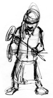


Vector Illustrations are entirely created on the computer, but as with any good art project, I began with some sketches. Sketches, as in plural: That's important. I really should show you all of my sketches, but trust me, they were bad. In fact, I started this project with an earlier sketch, and had to toss it all away, and begin again.

Lesson 1: the biggest mistake that beginners of computer illustration make is that they sit down at the computer and start working without any direction. An experienced artist could possibly sketch at the computer, but I still prefer paper and pencil. Always make several sketches, if not for yourself,then for your clients. Your initial sketch is usually not as good as your 4th or 5th, so do at least four sketches. I like this sketch because it has weight: you can feel how heavy the hammer is.



Now, I use Adobe Illustrator to create my vector illustrations. I am not going to teach you how to use that program here, but I will recommend taking a class as opposed to reading books on the subject. A good teacher can arm you with a variety of time savers and shortcuts that you may otherwise not pick up on your own.

So, to begin. First thing I do is scan in my sketch, and create a second layer to work on above it. I then choose my color pallete, and lay out flat colors in the basic shapes of the sketch. Working in layers is important, and can save you a lot of aggravation later! I am not a pro yet at vector illos, but I quickly learned that you can have thousands of shapes in one illustration, and keeping each unit of your drawing on a different layer will save you a lot of time.

After I am happy with the colors, and layout of the drawing, I then do the next important thing: I choose a light source. I cannot stress how important light is in almost any illustration. I mark this in some fashion, and then start laying in shadows to indicate to the viewer the light source.
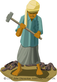


Much later, you can see my progress in the image above. I continued adding shapes to create more detail in the image, to indicate the folds and hang of cloth, to emphasize the weight, etc. I deepened the shadows, added secondary shadows, and played with the color pallete a bit to indicate the bright sun of an Indian beach. I also added the chain to create more interest, and to tell the viewer more about this scene: as a stand alone image, you need to add props to indicate 'place'.
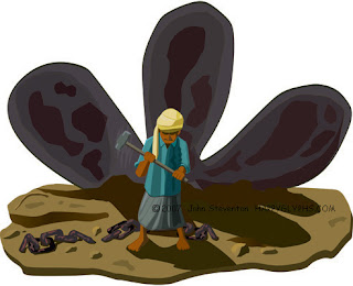


Finally, I decided to extend the background. I was happy with the look of the character: He looks tired, the hammer looks heavy, and you can see that he's been working hard. Still, I wanted to further isolate him... make him look smaller, and create more sympathy for him in the viewer's mind.

This illustration is for an article on ship breaking on the coast of India, which is a tough job. I wanted to give the viewer more of a feeling for this work, and more background in this illustration. I created the rusting propeller separately, and then moved it into this illustration. The nice thing about Vector Illustrations is that you can scale objects without losing resolution. I played with the illustration until I was perfectly happy with it, and then added more of the beach, and chain, and some rocks and other stuff, to finish the illustration.

I then went over the entire thing, looking for mistakes, and making sure that all the shadows indicated the same lightsource. That's something you have to look for if you bring two images together like this.

So there. Not bad for a first attempt, eh?

You'll be able to see more of this type of work at my homepage, and at my Freelance Portfolio page.

Cheers, JOHN :0)

What's on my iPod today? Kansas, Dust in the Wind.